I have a section of bolded text on this page "106 scholarships have been awarded" but it looks blurry. The font style is Open Sans.
https://dianec63.sg-host.com/scholarships
I am using bolded Open Sans on other sites and it looks fine:
https://midwestleadershipinstitute.org/mli-events/fall-2023-seminar
Bold text looks blurry
- Issue
-
dy87chf

-

- Commercial Templates
- Friday, 28 April 2023
- Subscribe via email

Please see the attached. Both versions are using Open sans font at 17px. The one on the left (sharp) is using J51 Layla template v3. The one on the right (blurry) is using J51 Kaylee v4. Here are the links for reference:
Layla template - https://www.sandwichpld.org/scholarships
Kaylee template -https://dianec63.sg-host.com/scholarships
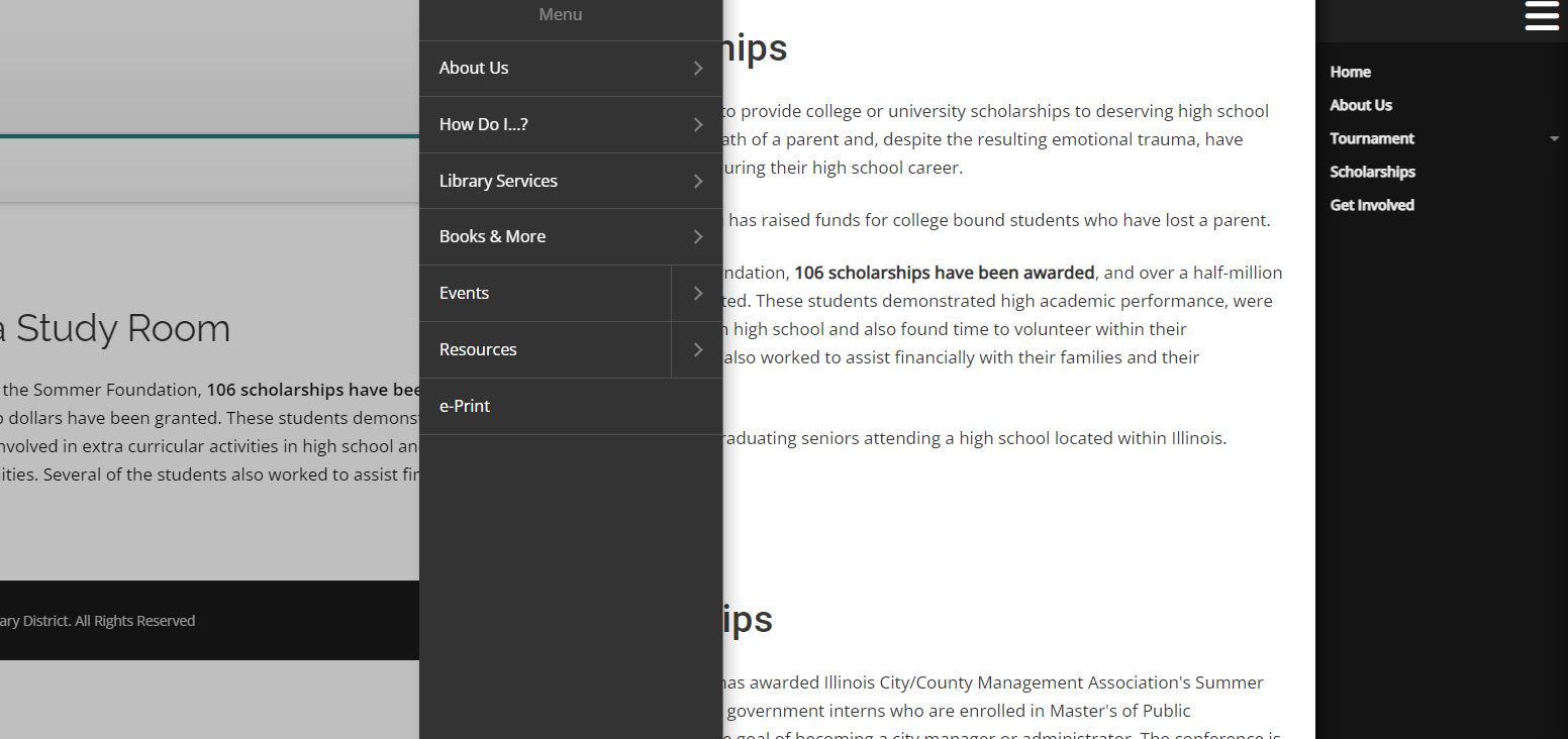
I'm also including a screenshot of the mobile menus for both. The one on the right is very blurry.

Layla template - https://www.sandwichpld.org/scholarships
Kaylee template -https://dianec63.sg-host.com/scholarships
I'm also including a screenshot of the mobile menus for both. The one on the right is very blurry.
Attachments (2)
- more than a month ago
- Commercial Templates
- # 2
difference is due to the font-weight.
Layla uses:
b, strong, th {
font-weight: 700;
}
Kaylee uses:
b, strong {
font-weight: bolder;
}
add:
b, strong, th {
font-weight: 700;
}
into your custom css
Layla uses:
b, strong, th {
font-weight: 700;
}
Kaylee uses:
b, strong {
font-weight: bolder;
}
add:
b, strong, th {
font-weight: 700;
}
into your custom css
- more than a month ago
- Commercial Templates
- # 3

Hello
To amend try adding the following to the Custom CSS field of your templates parameters (Extensions -> Templates -> [YourTemplateStyle] -> Custom CSS)....
Ciaran
To amend try adding the following to the Custom CSS field of your templates parameters (Extensions -> Templates -> [YourTemplateStyle] -> Custom CSS)....
* {

    -webkit-font-smoothing: none !important;

}
Ciaran
- more than a month ago
- Commercial Templates
- # 5
Hello
Maybe try auto instead.
If you wish you can experiment with the various smoothing values....
auto - Let the browser decide (Uses subpixel anti-aliasing when available; this is the default)
none - Turn font smoothing off; display text with jagged sharp edges.
antialiased - Smooth the font on the level of the pixel, as opposed to the subpixel. Switching from subpixel rendering to anti-aliasing for light text on dark backgrounds makes it look lighter.
subpixel-antialiased - On most non-retina displays, this will give the sharpest text.
This is the only difference between these 2 templates with the fonts you have rendered.
Ciaran
Maybe try auto instead.
* {

    -webkit-font-smoothing: auto !important;

}
If you wish you can experiment with the various smoothing values....
auto - Let the browser decide (Uses subpixel anti-aliasing when available; this is the default)
none - Turn font smoothing off; display text with jagged sharp edges.
antialiased - Smooth the font on the level of the pixel, as opposed to the subpixel. Switching from subpixel rendering to anti-aliasing for light text on dark backgrounds makes it look lighter.
subpixel-antialiased - On most non-retina displays, this will give the sharpest text.
This is the only difference between these 2 templates with the fonts you have rendered.
Ciaran
- more than a month ago
- Commercial Templates
- # 7
- Page :
- 1
There are no replies made for this post yet.
Be one of the first to reply to this post!
Be one of the first to reply to this post!
Please login to post a reply
You will need to be logged in to be able to post a reply. Login using the form on the right or register an account if you are new here. Register Here »