Custom CSS allows you to alter certain aspects of your templates styling. It is common that you may wish to apply such CSS to only certain screensizes or devices. To do so we have included a number of fields which can be found in the Responsive Options tab of your template settings.


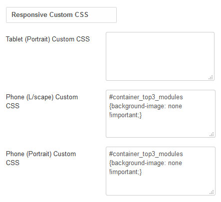
  1. Navigate to Extensions -> Templates  -> Styles -> [YourTemplateStyle] -> Responsive Options
  2. Add the CSS the corresponding field of the screensize you wish to change
  3. Click Save

It is important to note that if you wish to apply CSS to all screensizes less than a certain size you must add that CSS to each field belows that screensize. So for example if you wish your CSS applied to all screensizes less than tablet portrait you must added the same CSS to Tablet (Portrait)Phone (L/scape) and Phone (Portrait).

Join Our Newsletter

* indicates required
We respect your privacy and do not tolerate spam and will never sell, rent, lease or give away your information (name, email, number, etc.) to any third party. Nor will we send you unsolicited email.
Joomla51 - Mullaghmore, Co. Sligo, Ireland
Joomla51.com is not affiliated with or endorsed by the Joomla! Project or Open Source Matters.
The Joomla! name and logo is used under a limited license granted by
Open Source Matters
the trademark holder in the United States and other countries.

We use cookies on our website. Some of them are essential for the operation of the site, while others help us to improve this site and the user experience (tracking cookies). You can decide for yourself whether you want to allow cookies or not. Please note that if you reject them, you may not be able to use all the functionalities of the site.

Ok