


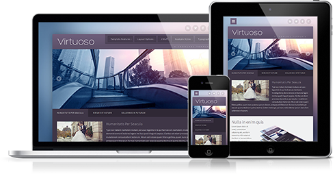
It has become common knowledge that every day the number of mobile devices used to view your site grows. Responsive design gives your site the power to provide an optimal viewing experience across a wide range of devices from a mobile phone to a desktop computer monitor.
 So how does it work? With the use of media queries different CSS style rules are loaded depending on characteristics of the device your site is been viewed with, most commonly the width of your browser. With each set of rules your site will be styled to best display on the matching device.
At Joomla51 we have embraced this new trend in website design and implemented responsive design to all our new releases, resolving any problems assoiciated with how your site will display on smaller resolution screens. To view how your template will respond to each screen resolution simply resize your browser window, as you reduce the width of your browser the template will react accordingly, altering its layout and style to best accomodate the site content within the available viewing area.
Alongside its responsive design, the template features a number of options within its parameters allowing you control over what content is displayed on smaller mobile devices. From your Joomla administration navigate to Extensions -> Template Manager -> J51_[YourTemplate] -> Responsive Options, here you will find a number of toggle switches to turn on/off each set of modules. If there is a situation where you would sooner your site to display the same on all devices then not to worry as we have added an option here to do that to (“,).