
CSS Grid works by first allowing you to define a grid on a parent container. You can then define how each child element of that container is positioned within that grid. This gives you a CSS layout module that allows you to easily create a sophisticated layout with simple easy to read markup. As great at this undoubtedly is, there are a number of reasonable limitations you will encounter once you start attempting to implement CSS Grid within a Joomla project.
The Problem with Dynamic Content and CSS Grid
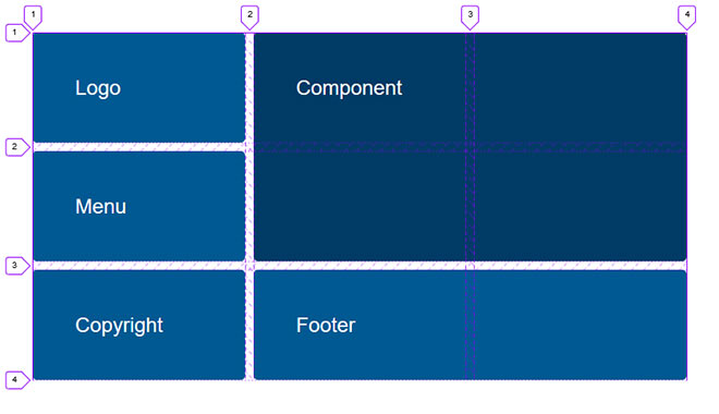
Joomla is incredibly versatile. Any given Joomla site can have multiple layouts depending on the modules enabled within any given menu item. The same is true for components where different component elements are displayed depending on the settings for that component. It is this dynamic nature of Joomla that poses a problem when using CSS grid. How element positioning is defined within a grid needs to change depending on its surrounding elements. Let’s take the following basic layout example which includes a component area surrounded by some likely module positions.
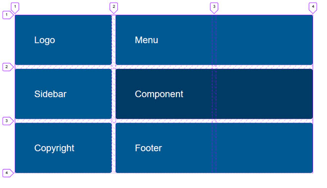
Using CSS Grid the above can be easily achieved with the following CSS which creates a simple 3 column grid and explicitly positions each child item within that grid.
.wrapper {
   display: grid;
   grid-gap: 10px;
   grid-template-columns: 1fr 1fr 1fr;
}

.top {
  grid-column: 1 / 4;
  grid-row: 1 / 2;
}

.sidebar {
  grid-column: 1 / 2;
  grid-row: 2 / 3;
}

.component {
  grid-column: 2 / 4;
  grid-row: 2 / 3;
}

.copyright {
  grid-column: 1 / 2;
  grid-row: 3 / 4;
}

.footer {
  grid-column: 2 / 4;
  grid-row: 3 / 4;
}
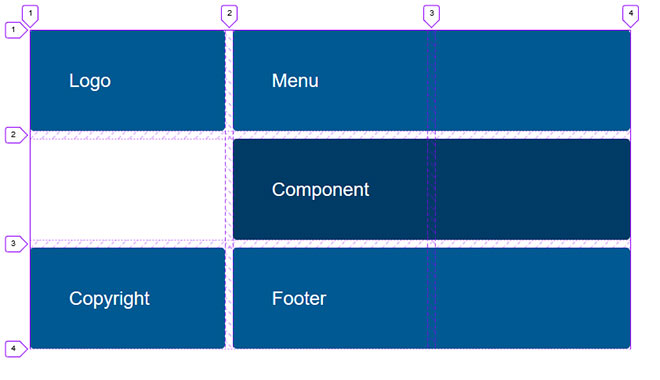
All fairly straight forward, however problems start to arise when elements of this layout are no longer published. Let’s consider a page where no module is published within the sidebar module position. Without redefining how surrounding items are positioned within the grid, the removal of the sidebar module will leave a blank space.
Unlike flexbox, CSS grid does not allow you to define how items ‘grow’ into empty space if available within the grid. It is reasonable to ask why this is not considered within the CSS grid spec, however when you look at the 2 dimensional nature of a grid, it is not quite that simple.
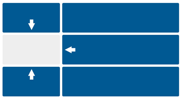
If you are familiar with flexbox, you will know that it works in one dimension meaning flex items are defined in either a row or a column but not both. Using the flex-grow property it is easy to define how an item will grow and expand within that single dimension. It is this dynamic nature of flexbox that makes it incredibly useful within Joomla, especially when you start worrying about how multiple modules flow when published within a single module position.

Being 2 dimensional, CSS Grid gets a little more complicated when you consider any number of items within the grid could potentially grow into an available space. Due to this extra complexity it is not in the CSS grid spec to manage this dynamically.
You are likely to ask about all those beautiful examples of CSS grid where content flows in to impressive layouts effortlessly. The problem with this type of layout is that the elements do not have a defined placement. Therefore an auto-placement algorithm kicks in to automatically place each item within the grid. Great for any kind of feed such as an image gallery however not so suitable when you have a definite placement in mind for most of your items which is certainly true for say a template layout.
A Solution
To get around this we need to somehow redefine how elements are positioned within the grid depending on the grid items that are present. We can do this by creating has-* classes for the items that exist within a page and effect the layout of that page. We then echo this class to the outermost container (eg. the html tag).
<php
$hasClass = '';
if ($this->countModules('sidebar-left')) {
 $hasClass .= ' has-sidebar';
}
?>

<html class="<?php echo $hasClass ?>"...
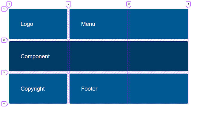
So we now have a has-sidebar class added to the html tag if a module is been published in the sidebar module position. Taking the previous layout example, we can now use this class to redefine the layout in our template CSS depending on if a sidebar module exists. So presuming we wish the component area to fill the space of the sidebar module we can simply have the following CSS..
:not(.has-sidebar) .component {
  grid-column: 1 / 4;
}
This CSS translates to if no has-sidebar class exists, extend the component area to the full width of the grid. This will result in the following..
I’ll point out that in this example a position is initially defined for every element, then the position is redefined if an element does not exist. Depending on the scenario it may be more logical to do this the other way around. So, rather than redefining the position when an element is not present, you instead redefine the position when it is present.
.component {
  grid-column: 1 / 4;
}

.has-sidebar .component {
  grid-column: 2 / 4;
}
Of course as this is CSS grid, you are in no way limited to how you change the layout of your site depending on what elements are present. Using the same class you can now completely redefine how each element is displayed within the grid.
:not(.has-sidebar) .component {
  grid-column: 1 / 4;
}

:not(.has-sidebar) .component {
  grid-column: 1 / 4;
}
Resulting in...
The same method can be repeated for any number of items on a page. has-* classes should be added for each item that the presence of would effect the layout of the page.
Interestingly we will soon see support for the :has psuedo class on browsers. This will remove the need of having to add the has-* classes. For further details on the :has psuedo class you can have a look at https://developer.mozilla.org/en-US/docs/Web/CSS/:has
With a little imagination you can realise how CSS grid in partnership with has-* classes offers great potential to Joomla and how we implement layouts. Layouts can be changed completely depending on what content is enabled without any change to the template or component view. Interesting times!